

Usability Study + UI Design for H*Nest
UX / UI Design, Product Design & Usability Study
My Role
Meetings with client, ethnographic research, usability testing, participants recruitment, presentation to client, UI Design
Roles during Usability Testing - Technician & Project Manager
Tools Used
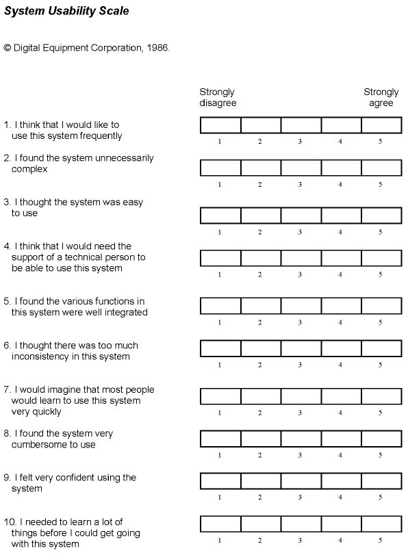
Adobe Illustrator, Adobe XD, Adobe InDesign, Carol M. Barnum’s Methodology of Usability Testing (e.g. heuristic evaluation, System Usability Scale)
My Team
Kiet Bui & Amanda Spilker
My Client
H*Nest
Timeframe
3 months
Background
Target Audience: Millennials and Generation Z interested in the tech industry
Product: Unite is a website-based platform for members (participants and sponsors alike) to sign up for events (design sprints, job fairs and tech socials) organized by the company. The purpose of these design sprints is to provide an occasion for members to connect with one another via activities relevant to the tech industry.
Problem / Why?
Through a series of Usability Tests referencing Barnum’s methodology, we assessed how intuitive Unite’s website was in achieving the following goals for the following target users —
Event participants should be able to:
Buy tickets for upcoming events
Apply for jobs
Communicate with other users
Sponsors should be able to:
Purchase sponsorship
Get to display their information for events they sponsor
Post jobs for people to apply to
Opportunities
We designed wireframes and UI mockups based on research findings for the company to take away for future reference. The project was later concluded by a summative presentation of our process, research findings and recommendations to the client.
Design Process / How?
Introduction to H*Nest
Phase results: Our team learned about the company’s mission and customers.
Defining target audience of Unite’s website
Phase results: Together with the client, we defined Unite’s users and how their needs aligned with the company’s demands.
Identifying end goals in terms of usability
Event participants should be able to:
Buy tickets for upcoming events
Apply for jobs
Communicate with other users
Sponsors should be able to:
Purchase sponsorship
Get to display their information for events they sponsor
Post jobs for people to apply to
Composing test plan and other documents
Phase results:
Introduce purpose of project, audience concerns and intended users (those interested in the tech industry)
Conduct heuristic evaluations on the website (consistency and standards, aesthetic and minimalist design, and error prevention)
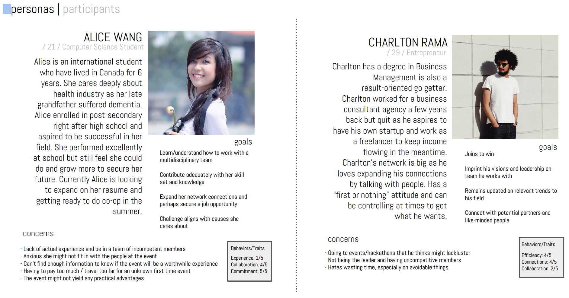
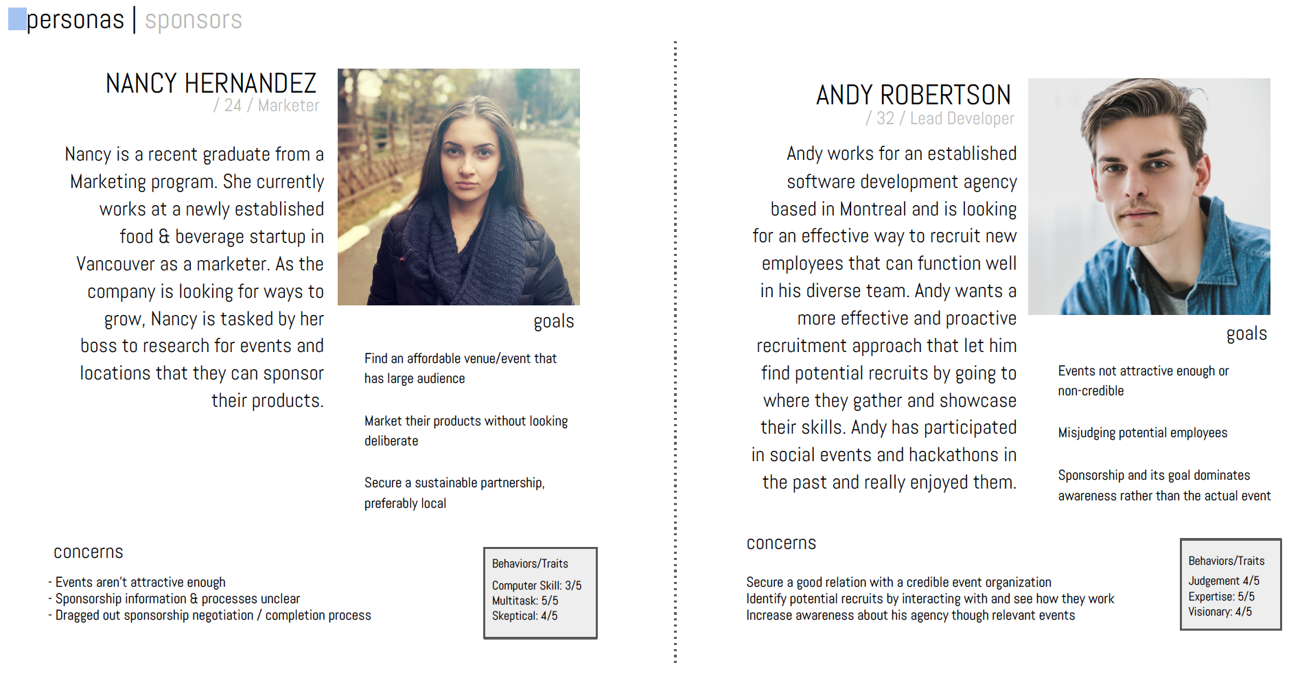
Construct personas of event participants and sponsors
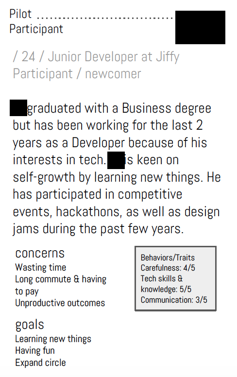
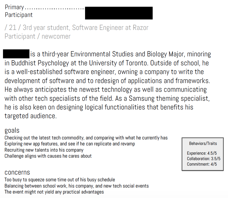
Screen and invite participants suitable for usability sessions
Explain in detail our methodology—systematic steps taken to get an insight of the intended users’ on the product
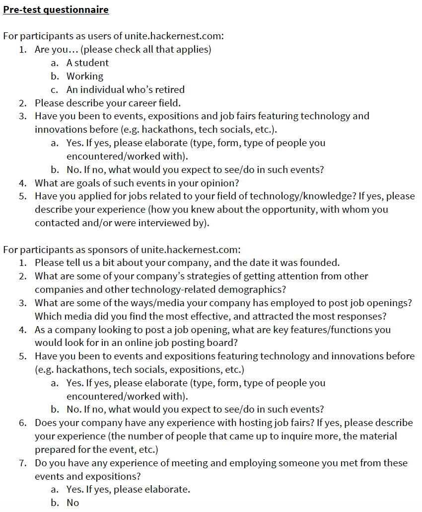
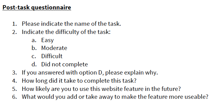
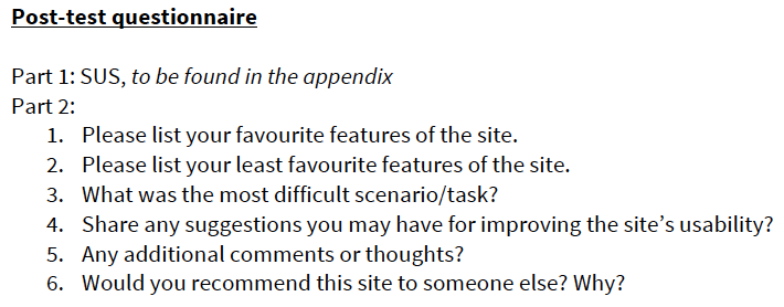
Establish tasks to be performed by participants—pre-determined ways the participant would interact with the product, pre-test, post-task and post-test questionnaires
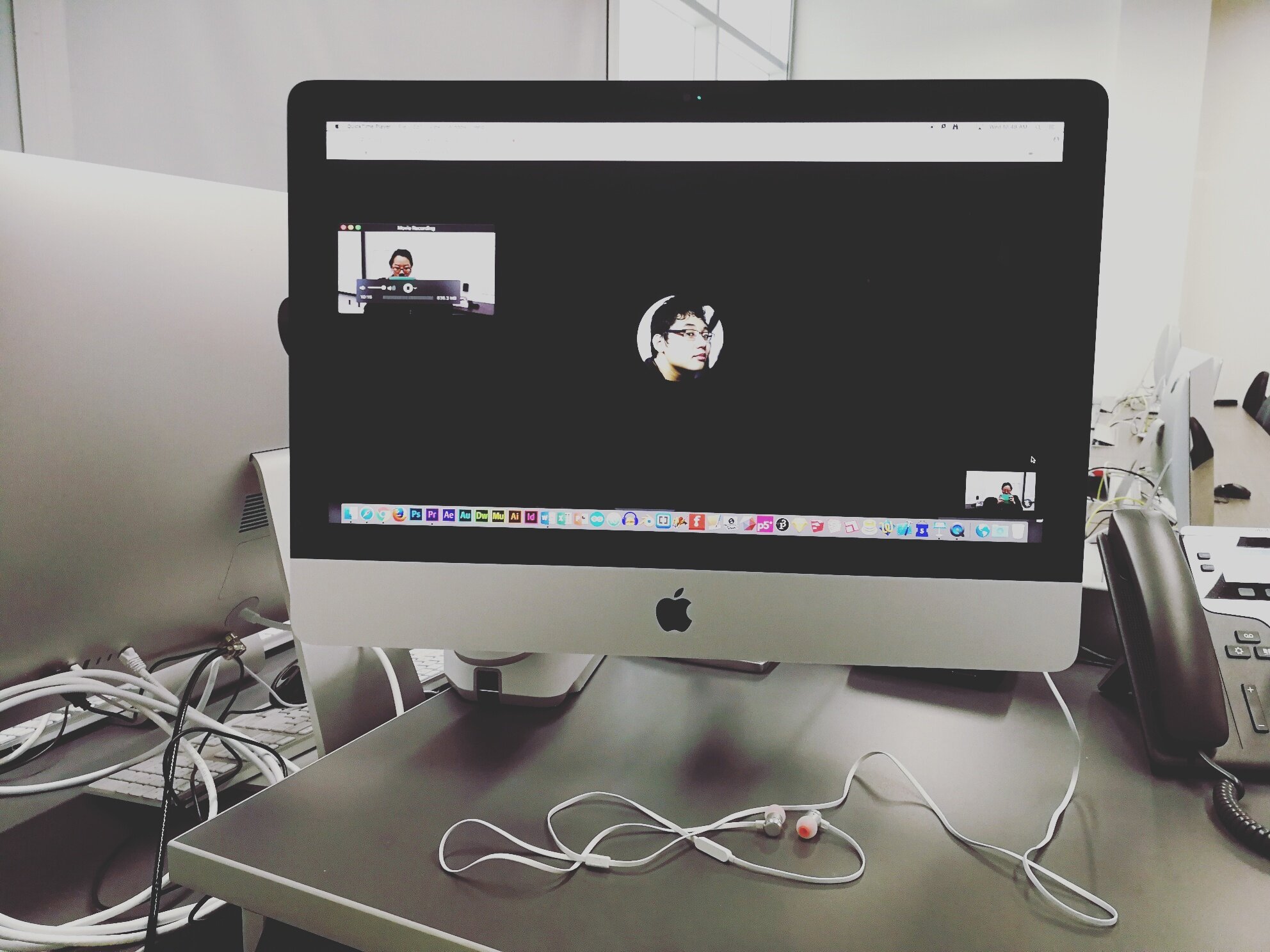
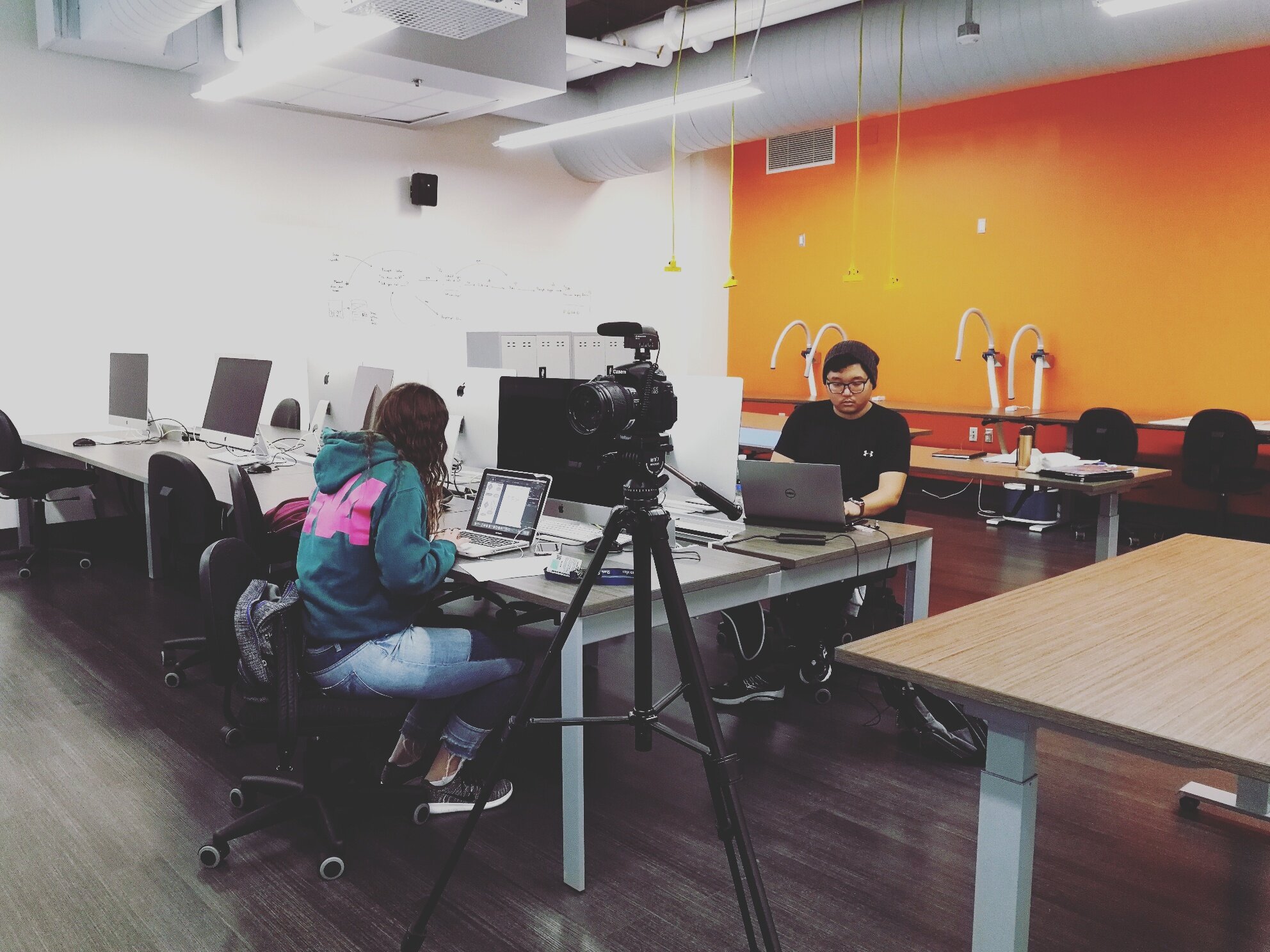
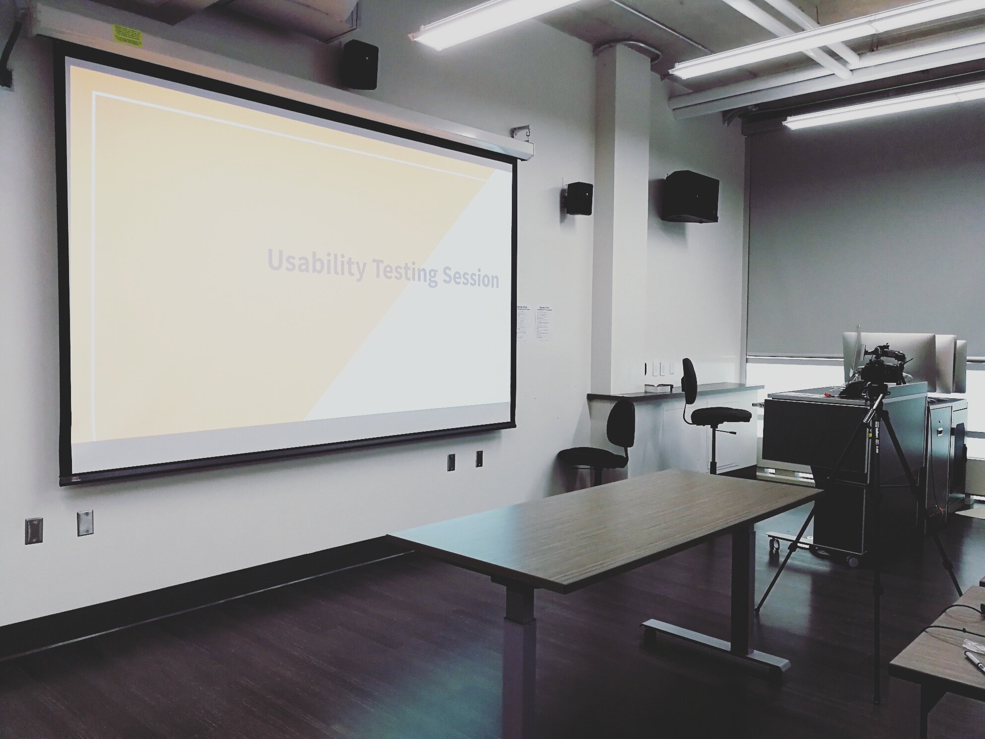
Conducting usability testing sessions
Phase results: 1st session—November 9, 2017 (9:30PM - 12PM), 2nd session—November 15, 2017 (9AM - 11:30AM)
Analyzing test findings
Phase results: A report documenting positive and negative findings, overarching themes, System Usability Score, recommendations in terms of navigation, layout, aesthetics, and new features.
Designing wireframes and UI mockups
Phase results: A set of wireframes and UI mockups were developed for the client to take away for future references.
Presenting to client
Phase results: We delivered a presentation of positive and negative findings, overarching themes, recommendations, wireframes and UI mockups to the client on January 13, 2018.
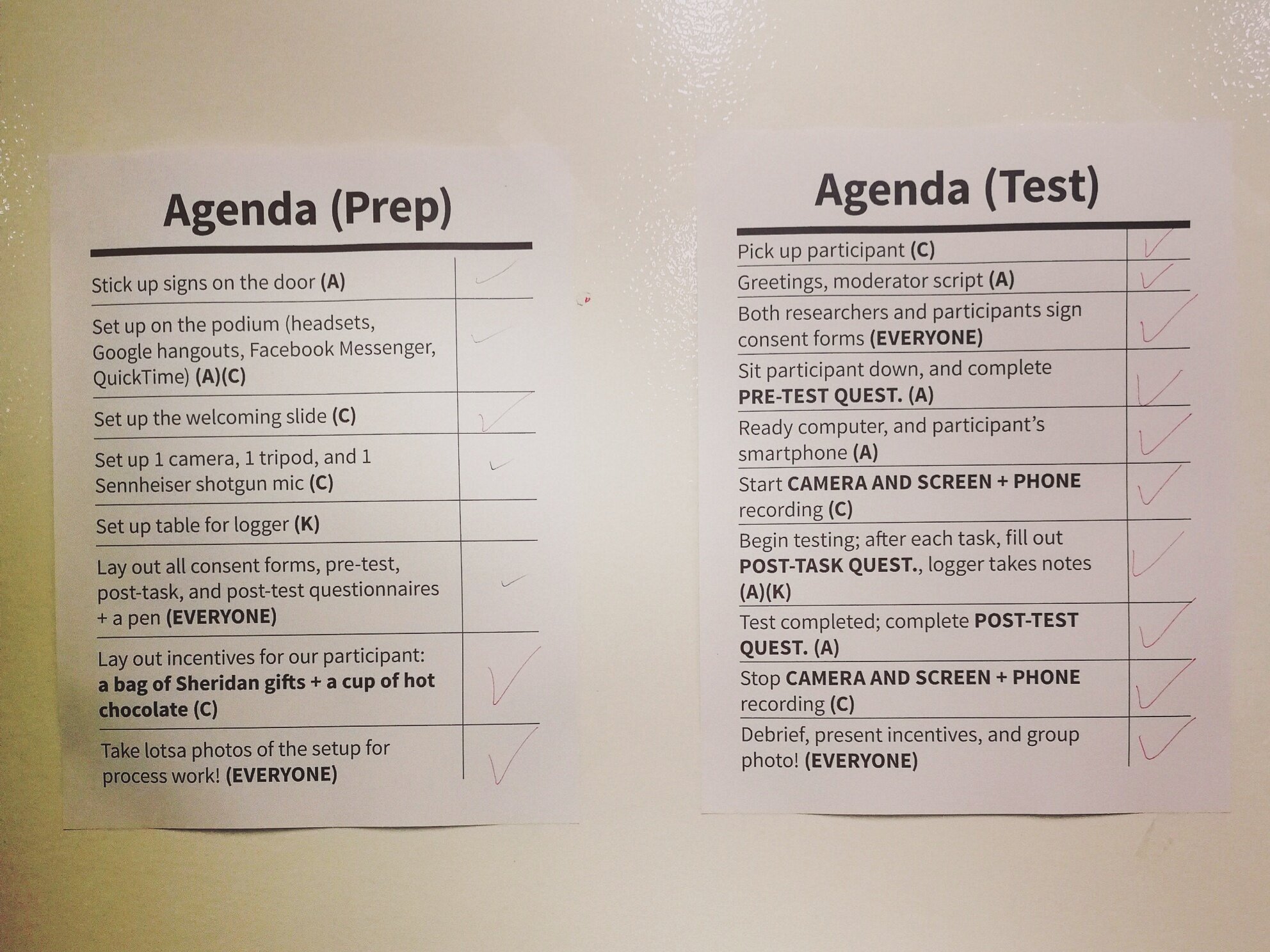
Usability Testing Preparations
Usability Testing - On the Day of
Final Prototype(s) / What?
Sample task for event participants (one of six tasks)
How To Buy an Event Ticket
Goals/Output: The user will be able find and purchase a ticket to an event on the website.
Inputs / Assumptions:
Have an account
The user has never been to an event that requires payment before
Steps
Load main webpage
Sign into personal account
Click the “Fishackathon” tab
Find event that you wish to attend and click “view”
Scroll down and find the ticket price
Click “Buy a Ticket”
After being redirected, fill out the “Fishackathon Survey”
After filling in survey, fill in payment method and click “Submit Payment”
Time for Expert: 10 minutes
Instructions for User: Intrigued by the name ‘Fishackathon,’ you are thinking of purchasing a ticket to attend a ‘Fishackathon’ hosted taking place in Melbourne, Australia. Please accomplish the task by interacting with the website.
Usability problems expressed by participants
“Website Feature”: (1) A user needed to create two accounts to confirm and RSVP to an event. (2) When purchasing a ticket the price was not that of the user’s currency.
“Navigation”: Some navigation bar links opened in the website, some did not.
“Website Feature/Navigation”: Some events were paid and some were not.
“Aesthetic”: The front page was cluttered with information, and the main photo was not interesting enough.
Overarching themes
Lack of trust on the website
Decreased engagement / interest due to tedious process
Inconsistency
Recommendations (three of ten)
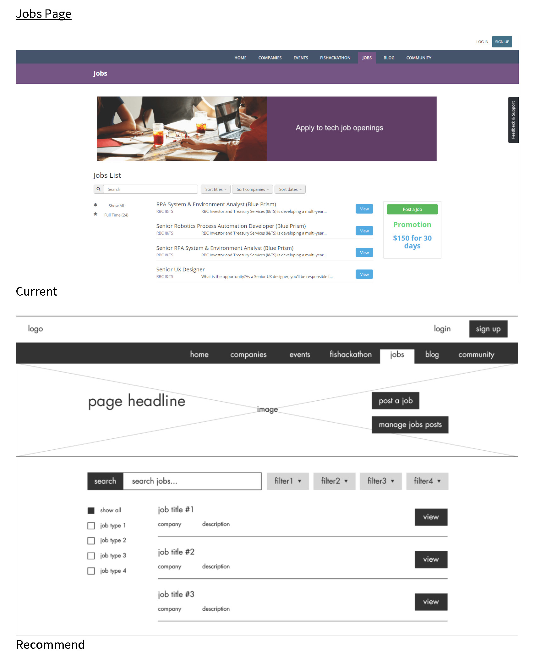
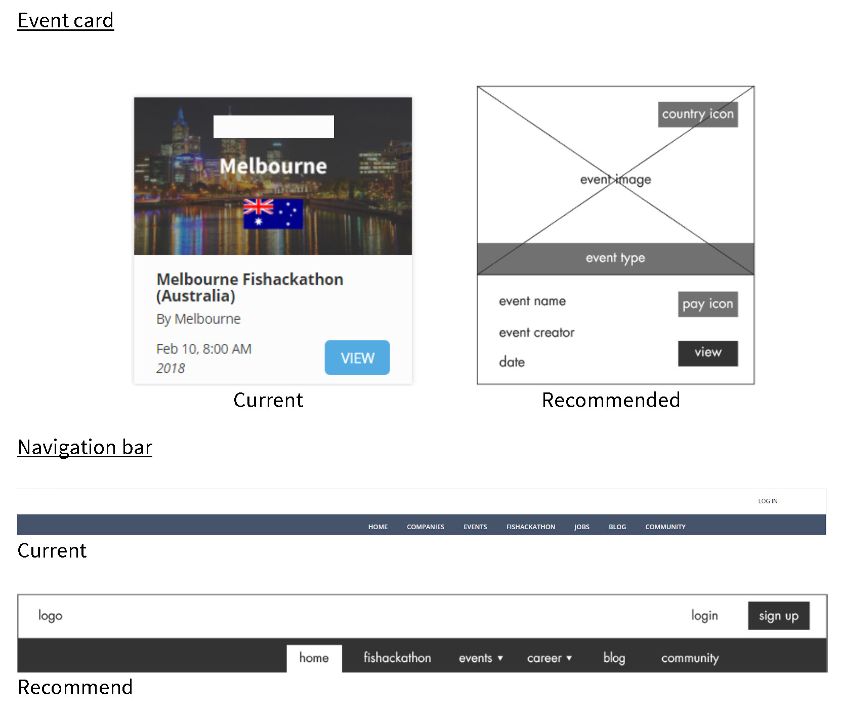
Layout & Aesthetic—Event page: List events based on user’s location rather than alphabetic, also indicate if event requires payment or not. Clearly define between Events and Groups by treating them as different subpage or highlight the tabs. Within each event card, make a distinction between what type of event it is (hackathon, social gathering, etc.) by color-coding and indicate whether it’s free or paid.
Layout—Homepage: Create more space between content rather than laying on a grid. Define clearly which content is clickable and which are merely descriptive, such as only have hover highlight over the buttons rather than the whole card.
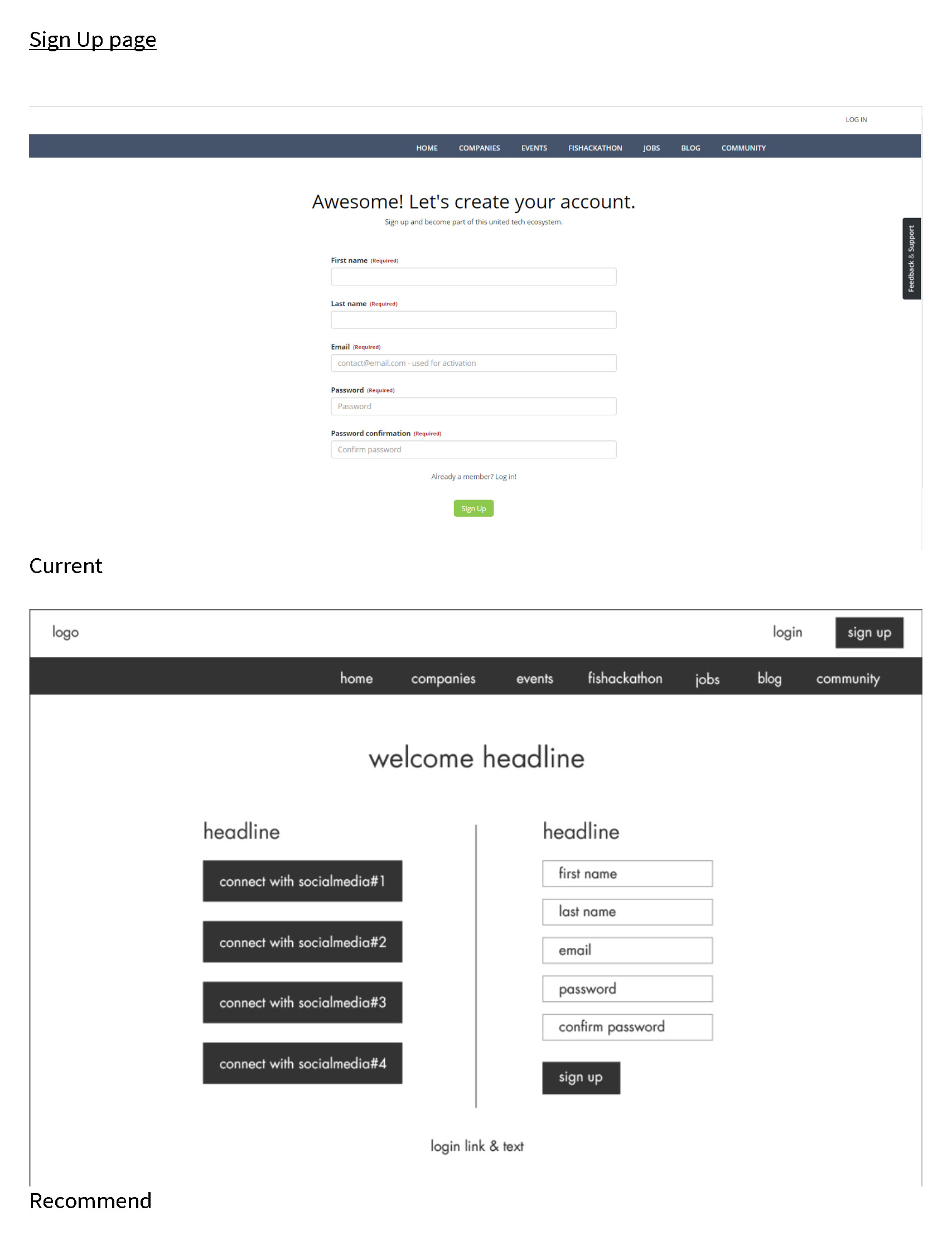
Feature Request—Account signup / login: Add feature of signup/login using existing social platform accounts side by side with new account registration. The process of creating a new account and setting up password is cumbersome to new users especially considering how popular integrate existing social network accounts is currently.
Wireframes
UI Mockups
Click image to see Adobe XD UI mockups.
What did I learn?
This project allowed me to practice communication skills with client. Weekly follow-up meetings kept the team in check.
Why usability? “Because it guides every component to the product, from buttons, layouts to accessibility. Simply put, if the product is not usable and user-friendly, customers will not come back for it! Before there is delight to using the product, users must first find the product logical and intuitive to use, the way users want them to work.”
What would I have done differently?
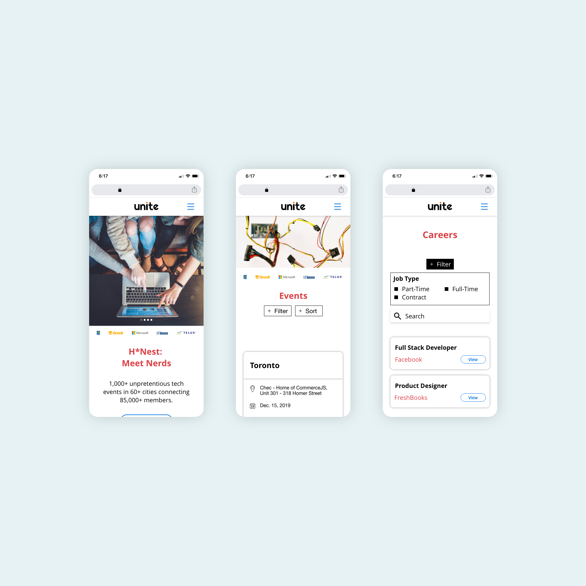
To further develop this project, I would continue developing UI mockup for web and tablet. Knowing Millennials and Generation Z have a tendency to browse on their smartphones, the team was able to convince the client for designing mockups for mobile first, however, to make the product more accessible to more users, mockups for web and tablet are worth considering.